
MedSync Pro App
Role: UX designer.
Responsibilities: Conduct interviews, paper and digital wireframing, low and high-fidelity prototyping, conducting usability studies, accounting for accessibility and iterating on designs.
MedSync Pro is an innovative mobile application developed to cater specifically to the complex medication management needs of elderly patients. The application serves as a comprehensive medication reminder system, designed to ensure timely and accurate intake of prescribed medications, thereby enhancing adherence and promoting better health outcomes.
The problem:
Elderly patients face challenges in managing multiple medications, leading to poor adherence and health risks. With more chronic diseases and prescriptions among the elderly, there’s a pressing need for a simpler, more effective medication management solution.
The goal:
Develop MedSync Pro, a user-friendly medication reminder app for the elderly, to improve medication adherence and simplify management, thereby enhancing overall well-being and reducing associated health risks.

Intended users
The intended users for MedSync Pro are senior citizens who lead active lifestyles, engaging in various activities and hobbies. Despite their busy schedules, they may often struggle to remember their medication schedules. They require an easy-to-use medication reminder application that can help them efficiently manage their medication routines. The application should offer adjustable and straightforward reminders to suit their dynamic lifestyles.
User research: pain points
Complex medication schedules:
Elderly patients can find it hard to handle their many different medications with different schedules.
Trouble with setting reminders:
Difficulties in setting up and customizing reminders within the app, particularly if the process requires multiple steps or complex configurations.
Accessibility:
Certain accessibility features are necessary for users with vision and hearing impairments.
Persona development
Hal is an active senior citizen who likes to keep a busy schedule. As a result, he can often forget to take medications throughout the day. He would like to have a more efficient method for reminding him to take medication.


Design process
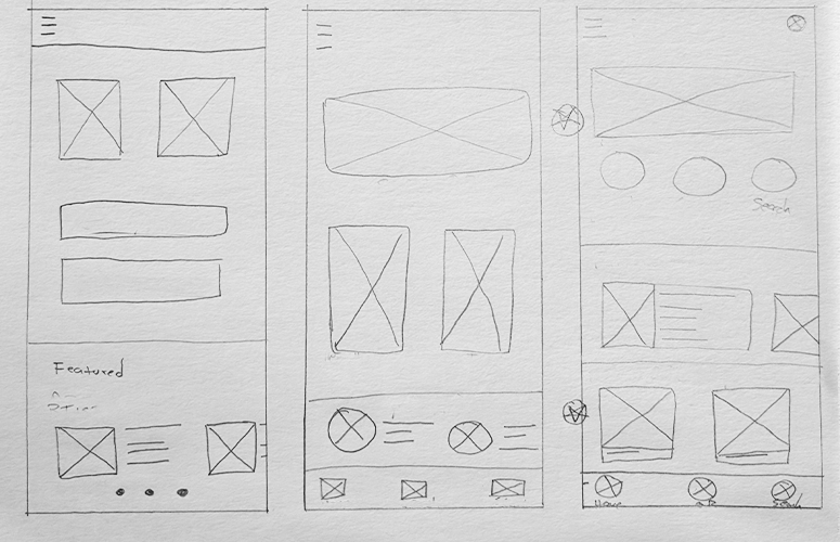
Paper wireframes:
Producing several paper drafts for each app screen before converting them into digital wireframes was a purposeful approach, guaranteeing that the chosen elements efficiently addressed the users’ challenges.
Digital wireframes:
The digital wireframes were developed in Figma, incorporating feedback from paper wireframes.
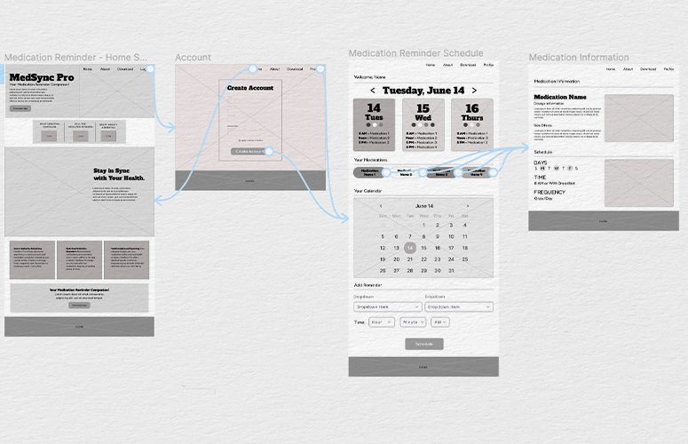
Low-fidelity prototype:
The initial prototype linked the main user journey of signing up and accessing a daily agenda.
Usability study: findings
I conducted two rounds of usability studies. Findings from the first study helped define the designs from wireframes to mockups. The second study used high-fidelity prototypes and helped establish a more refined layout.
Round 1 Findings
1. Users felt the schedule page was too busy.
2. Adding a medication reminder needs to be simpler.
3. Streamline the design of the homepage to provide clear details and next steps.
Round 2 findings
1. The homepage still had extra content that was not relevant to various users.
2. The scheduling page should feature more intuitive selections.

Refining the design
The initial home screen design provided excessive information and led to confusing navigation paths. Following the usability studies, I streamlined the design to feature a concise login and clear subsequent steps. Subsequently, users are directed to a profile page that establishes a distinct hierarchy for pertinent information.
After a second usability study, participants expressed frustration with the daily reminders page. They felt the options were no intuitive and needed to be simplified.
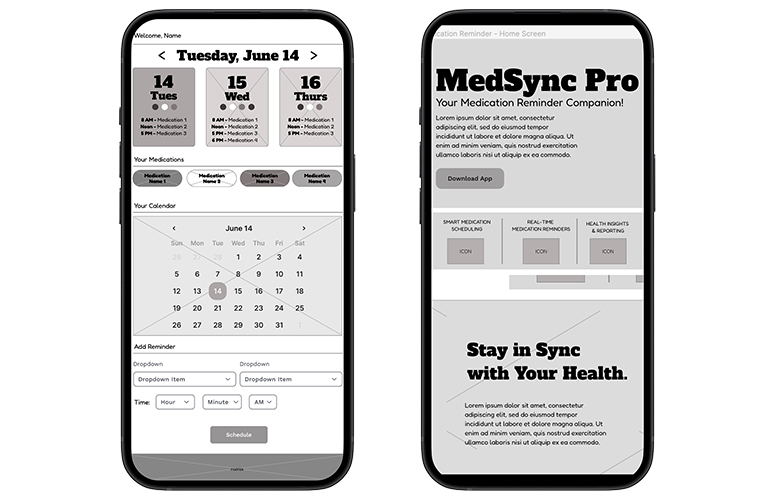
High-fidelity prototype
The high-fidelity prototype has been enhanced to include a more straightforward method for adding medications and viewing a user’s schedule. Notably, the buttons and navigation have been adjusted to cater to the target audience, who had previously expressed difficulties in locating certain tasks. This prototype ensures a user-friendly experience by simplifying complex processes and streamlining the overall navigation flow. With improved accessibility and intuitive design, users can effortlessly manage their medication intake and access their schedules with ease, addressing the specific challenges highlighted during the design process.
Takeaways
Impact:
The application serves as a valuable resource, enabling users to establish timely reminders and effectively manage their medication schedules on a daily basis. With its intuitive interface and comprehensive features, the app empowers users to stay organized, ensuring they never miss a dose and effectively adhere to their prescribed medication regimen.
What I learned:
Throughout the app development process, I came to realize that implementing straightforward solutions often led to the most impactful outcomes, particularly when designing for senior populations. An interesting revelation was that senior users exhibited a strong preference for an uncluttered and simplified home screen interface. By presenting clear and uncomplicated options, it became evident that users were more inclined to follow a clear path, ensuring ease of navigation and enhanced user experience.