
Craftsman’s Brewing Co.
Role: UX designer.
Responsibilities: Conduct interviews, paper and digital wireframing, low and high-fidelity prototyping, conducting usability studies, accounting for accessibility and iterating on designs.
Craftsman’s Brewing Co. is a conceptual site for a craft brewery business that aims to create an optimal online experience through an intuitive website designed for both desktop and mobile devices. Users can easily locate their favorite beer, learn about the brewery, and place orders via a hassle-free process. The website simplifies the selection process, facilitates secure payments, and ensures convenient delivery or in-store pickup of your chosen beverages.
The problem:
The current online ordering system for our local craft brewery presents significant challenges for customers, leading to frustration and a potential loss of sales. Users encounter difficulties in navigating the website, locating specific products, and completing the ordering process seamlessly, resulting in a suboptimal user experience that hinders the brewery’s growth and customer satisfaction.
The goal:
The goal of this UX project is to enhance the online ordering process for our local craft brewery, aiming to create a seamless and intuitive interface that simplifies product browsing, selection, and checkout.

Intended users
Intended for craft beer enthusiasts and casual consumers alike, the enhanced online ordering system by Craftsman Brewing Co. caters to individuals seeking a convenient and engaging platform to explore and purchase a diverse range of artisanal brews. With a user-friendly interface designed for both tech-savvy and novice users, the platform aims to appeal to a broad demographic, offering a seamless and enjoyable experience for anyone looking to discover and savor high-quality craft beers.
User research: pain points
Difficulty in finding specific beer products:
Users may struggle to locate their preferred craft beers due to an inefficient search function and unclear categorization, leading to frustration and a prolonged browsing process.
Complex and lengthy checkout process:
Users might face challenges during the checkout phase, encountering confusing steps or a lack of transparent information about payment options and delivery details, resulting in abandoned orders and dissatisfied customers.
Non-intuitive navigation and site structure:
Users may find it challenging to navigate through the website, with a cluttered layout, confusing menu options, and a lack of clear guidance, leading to a confusing and time-consuming browsing experience that discourages repeat visits.
Persona development
Julia, a devoted craft beer lover, is in search of a straightforward and user-friendly method to order her favorite brews from the local brewery. Currently, she has encountered challenges and feelings of frustration while trying to navigate the ordering procedures at various craft breweries.

DESIGN PROCESS
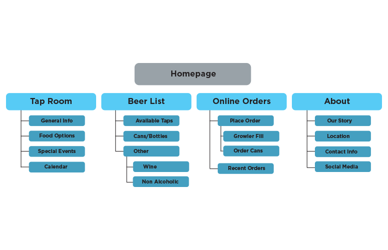
Paper wireframes:
Creating multiple hand-drawn drafts for each screen of the site before transforming them into digital wireframes was an intentional strategy, ensuring that the selected components effectively targeted the users’ specific difficulties, with a particular emphasis on previewing and selecting items throughout the ordering process.
Digital wireframes:
The digital wireframes were developed in Adobe XD, incorporating feedback from paper wireframes.
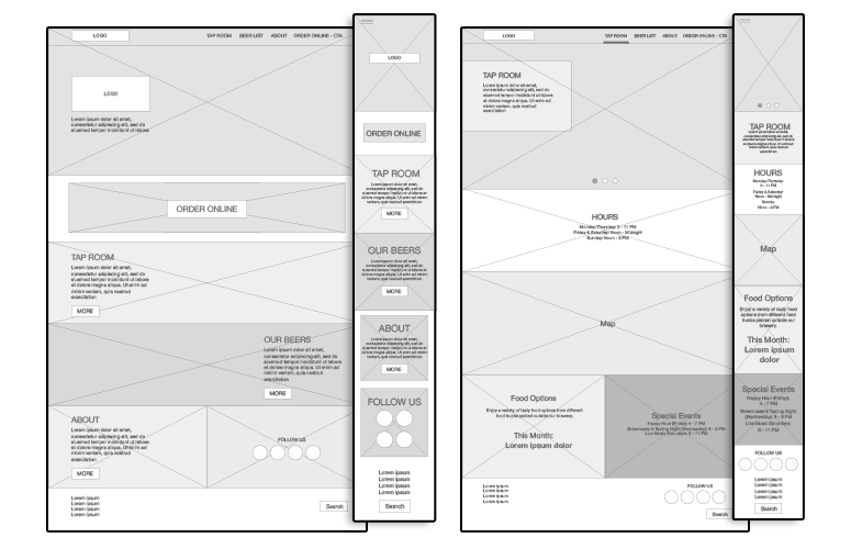
Low-fidelity prototype:
The low-fidelity prototypes were developed by translating the hand-drawn drafts into digital wireframes, focusing on the elements related to previewing and selecting products during the ordering process.
Usability study: findings
I conducted two rounds of usability studies where participants were instructed to place an order, and the findings from the initial study guided the transition from wireframes to mockups, with a specific focus on enhancing the preview and selection elements.
Round 1 Findings
1.Participants expressed confusion in locating the product preview option within the low-fidelity mockups, resulting in a delay in the selection process.
2. Participants highlighted the need for clearer navigation cues to move between different beer categories, indicating potential frustration with the current layout.
Round 2 findings
1. Users responded positively to the improved product preview feature, noting a smoother and more efficient selection process compared to the initial round of testing.
2. The revised ‘add to cart’ functionality received praise for its enhanced visibility and ease of use, leading to a more seamless ordering experience for the participants.
3. Users navigated more easily, finding products efficiently, resulting in a user-friendly experience.
HIGH-FIDELITY PROTOTYPES
Refining the design
The website underwent significant enhancements to ensure a more intuitive and seamless user experience. Iterative improvements were made to the navigation structure, emphasizing clear categorization and simplified product exploration. The design elements were streamlined, focusing on enhanced visibility for essential features such as product previews and the ‘add to cart’ functionality. Incorporating valuable feedback from user testing, the layout was meticulously fine-tuned to optimize user interaction and facilitate an effortless ordering process for visitors.
High-fidelity prototype
The high-fidelity prototypes for both desktop and mobile versions integrated user feedback, ensuring intuitive navigation and prominent product features. The refined layout aimed for consistency and accessibility across devices, providing a seamless and engaging user experience.
Takeaways
Impact:
The website project, focused on exploring the UX process and tailored to meet specific criteria for online ordering, yielded significant improvements in user satisfaction and engagement. The enhanced interface, intuitive navigation, and prominent product features resulted in a seamless and enjoyable online ordering experience, establishing the brewery as a preferred destination for craft beer enthusiasts.
What I learned:
Through the development process of this website, I gained valuable insights into the intricacies of creating a user-friendly interface for online ordering platforms. I learned the importance of incorporating intuitive navigation, prominent product features, and streamlined checkout processes to enhance user satisfaction and drive engagement. Additionally, I gained a deeper understanding of the significance of iterative user testing and feedback incorporation in refining the overall user experience, emphasizing the crucial role of continuous improvement in achieving a successful and customer-centric online platform.