
Bio Artistry App
Role: UX designer.
Responsibilities: Conduct interviews, paper and digital wireframing, low and high-fidelity prototyping, conducting usability studies, accounting for accessibility and iterating on designs.
BioArtistry is a concept app that enriches a users gallery experience by instantly delivering an artist background information. The apps user-friendly platform, effortlessly unites personal insights and gallery information in a single, easily accessible hub.
The problem:
In intimate gallery environments, acquiring the backstory of a featured artist can frequently present difficulties. Though this information might be accessible, its ease of access is not consistently straightforward.
The goal:
Develop an application that simplifies the process of accessing an artist’s background information while in a gallery setting.

Intended users
Through research, I pinpointed a key user segment: regular gallery attendees who are keen on accessing background details about the exhibited artists.
Based on the research findings, it was evident that users expressed a desire not only for information about artists but also for insights into the galleries themselves. Their interests extended to details about both ongoing and previous exhibits, as well as general background information about the gallery. Moreover, the research indicated a preference among users for various means of accessing information, including QR scans and conventional search input fields.
User research: pain points
Availability: Gallery visitors had trouble locating
ancillary information on an artist.
Details: Gallery visitors often want more information outside of the artists name and the title of the work.
Accessibility: Available searching methods are not equipped with assistive technologies.
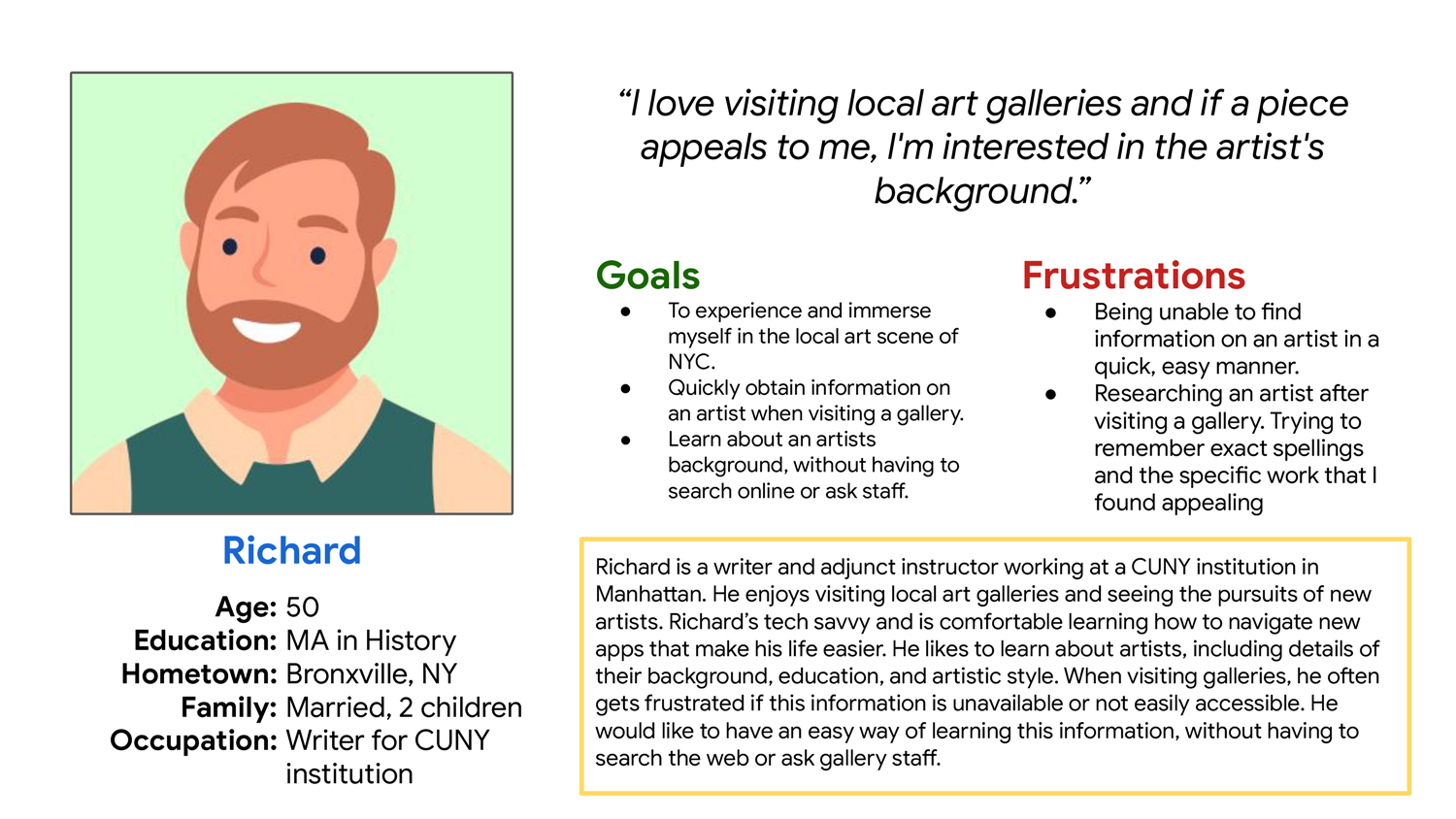
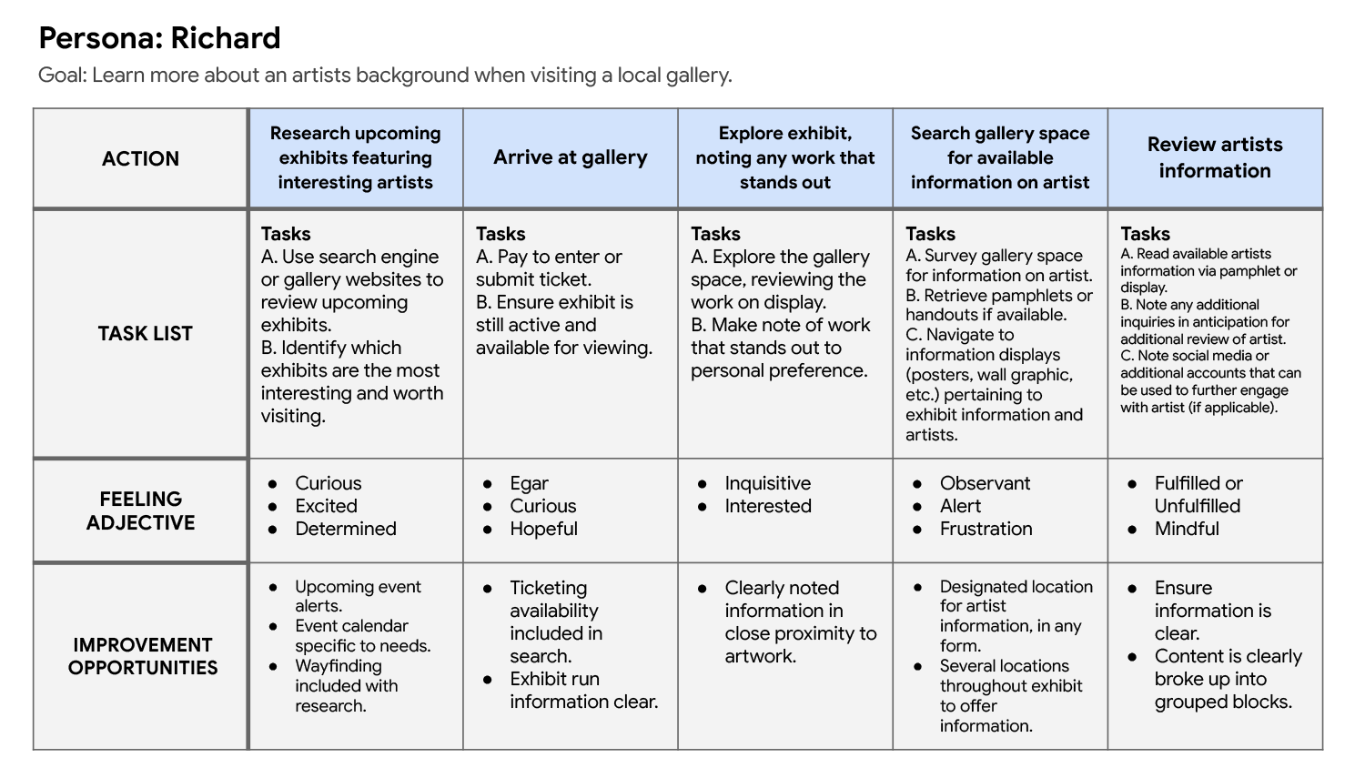
Persona development
Richard: Richard is a frequent gallery visitor who wants a simple method for learning background information on featured artists, because obtaining these details can be challenging or confusing in some gallery settings.

Design process
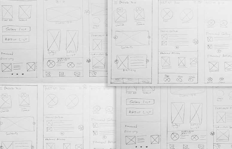
Paper wireframes:
Creating multiple drafts of each app screen on paper before translating them into digital wireframes was a deliberate process that ensured the selected elements effectively addressed the users’ pain points.
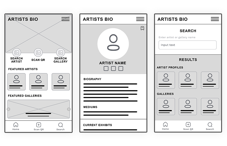
Digital wireframes:
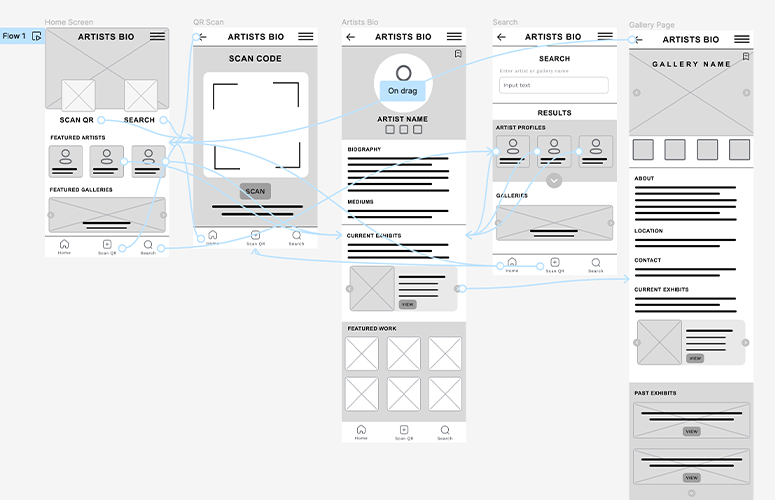
The digital wireframes were developed in Figma, incorporating feedback from paper wireframes.
A robust artist profile page, featuring biographical information, current exhibit information, and a curated collection of their work.
Low-fidelity prototype:
Low-fidelity prototype connected the primary user flow of scanning a QR or searching an artist so the prototype could be used in a usability study.
Usability study: findings
I initiated two rounds of usability studies. Insights garnered from the initial study informed the development process from wireframes to mockups.
Round 1 Findings
1. Users preferred the QR scan method for obtaining information.
2. Research results need more structure and hierarchy.
3. The homepage should be simplified.
Round 2 findings
1. The menu selection had too many options.
2. The search results did not include enough information to make an informed selection, specifically with artists.

Refining the design
Early designs for the home screen displayed an array of buttons and sections, including the main search functions and featured material. After the usability studies, I updated the home page to provide quick options to the main functions of the app.
After a second usability study, participants expressed confusion with the search results feed, specifically with the layout. To resolve the issue, I separated search results sections into clearly identified segments with specific design attributes.
High-fidelity prototype
The final high-fidelity prototypes employed a straightforward layout to enhance the user’s experience by simplifying choices and improving the layout of the search results page.
Takeaways
Impact: Overall, the app enhances a users experience at a gallery. It makes the visit multifaceted and engaging on multiple levels.
What I learned: While developing the app, I found that simple solutions often worked best. For example, I noticed that users liked a clean home screen. Having just 2 buttons among all the content proved to be the best approach.
Next Steps
- Develop a user profile, allowing users the ability to customize settings and build on their artistic interests.
- Expand on the artist profile pages to include external content, such as social media channels and contact information.